Reports
Results of a pipeline execution are aggregated into easily understandable formats for quick viewing.
Overview
Each pipeline execution generates an HTML report. The final report and other files can be accessed through the Reports window (Fig.). Reports can also be accessed through the ReportID on the job details page.
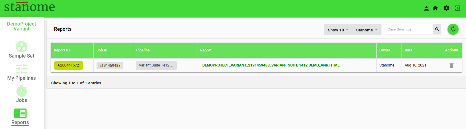
- Click Report ID to access intermediate files from a few important steps in the pipeline.
- Click the PREFIX_ANR.HTML to access the final downloadable report. Default: NO REPORT AVAILABLE.
Reports are generated dynamically based on the analysis type and each report is divided into sections based on the tools used in the pipeline. The first two sections are generated for all the jobs to provide the job overview: analysis summary and sample quality.
- Analysis Summary:
This section consolidates the information related to the job: project, samples, and the experiment in four sub-sections:
-
-
- Project Details: This shows the information provided during the project creation and the pipeline details.
- Run Summary: Displays the job status, runtimes, and the files used for the analysis: reference, annotation or metadata files, and the samples.
- Tools: A brief summary of the tools, versions, descriptions, and citations is shown.
- Commands: A complete list of the commands used in the pipeline.
-
- Sample Quality:
Details of sample (sequencing) quality are provided in this section. It has two sub-sections:
-
-
- Metrics Table: This shows the sequence quality details of each sample in a tabular format.
- Sample Quality Plot: The average quality scores (Phred scale) of all the reads in a sample are displayed in a 96-Well plate format, each circle representing a sample. The higher the score, the better, and scores above 30 are generally considered good for the majority of the applications. Average scores are calculated using all the reads in a sample with the FastQC tool. The 96-Well plate format helps to visualize the low-quality samples, plate effects, and pooling errors easily.
-
The remaining sections are dynamically generated based on the pipeline type and the tools used. Two sample reports are provided below to understand the features of each report.
Variant Report
Variant calling pipelines contains two exclusive sections.
Mapping
This section provides details of the abundance/mapping statistics. This section also has three sub-sections:This
-
-
- Data Table: This (Fig. 1) shows several alignment statistics such as the number of total processed reads, the number of mapped or multi-mapped reads, and the uniquely mapped reads.
- Sample Coverage: Allows users to explore the alignment quality through a series of plots. Sample depth of coverage in total read counts. Sample depth of coverage in percentages. On-target mapping quality in a 96-well plate format
- Read Lengths: Histograms and 96-well plate plots show the read length distributions for mapped and unmapped reads.
- Genome Browser: Aligned reads against the reference genome can be viewed for each sample. The genome browser is interactive and allows exploratory analysis.
-

Variant Calling
This section provides details of the abundance/mapping statistics. This section also has three sub-sections:
-
-
-
- Call Rate Summary: Provides a summary of the genotype calls.
- Target Call Rates: Genotype calling metrics for the top 100 targets are shown in the table format. The complete list can be downloaded from the Reports section. The position field is cross-linked to the Variant Browser. This section also shows:
- Genotype call distribution
- Genotype Heatmap
- Sample Call Rates: Histograms and 96-well plate plots show the call rate distributions from all the samples.
- Genotypes: Shows table of genotypes obtained for each marker across all the samples
- Variant Browser: Sequencing reads support for each variant can be viewed for each sample (Fig. 2). The genome browser is interactive and allows exploratory analysis.
-
-

Transcript Report
This report contains three exclusive sections.
Mapping (Salmon/Kallisto):
This section provides details of the abundance/mapping statistics. This section also has two sub-sections:
-
-
- Data Table: This shows several quasi-alignment statistics such as the number of total processed reads, the number of mapped or multi-mapped reads, and the uniquely mapped reads.
- Plots: Show the sample depth of coverage plots ( mapped and unmapped reads) in raw numbers and percentages.
-
Differential Expression (DE):
Details of the differential expression analysis are dynamically displayed for the pipelines which contain the DE step. This has the following four sub-sections:
-
-
- Data Table: Top 200 most significant Differentially Expressed Genes (DEGs) are listed in tabular format. The table also provides fold change values, confidence levels, and various other parameters. The tool and its various parameters that were used for identifying the DEGs are described briefly below the table. All the important parameters are also described.
- Heatmap: The heatmap (Fig. 1) of the top 200 DEGs. Heatmap visualizes the comparison of DEGs expression across samples and within the sample. A brief description below the map enables users to understand and interpret heatmaps. The red color rectangle in the heatmap indicates the upregulation of a gene and the blue color indicates downregulation.
- PCA & Volcano Plots: A PCA plot enables users to visualize the variability in the replicates of the two experimental conditions compared. All replicates of a condition are depicted with the same color. Grouping of samples indicates if replicates are similar among the same condition versus between the conditions.
- The volcano plot shows significantly differentially expressed genes. It is a scatter plot between log fold change of expression among different biological conditions and the significance of the change determined from the p-value. Volcano plots enable visual inspection of expression change across all the genes.
- Density: Shows normalization plots of samples normalized to overcome bias due to Read size and mRNA content.
-

Annotation (FGSEA):
Describes Pathway analysis for DEGs (Fig.2). The top 100 enriched pathways are shown in the table along with their p-value and the total number of DEGs belonging to the pathway. This section also shows a bubble plot of the enriched pathways wherein the location of the bubble is determined from %DE genes in the enriched pathway to the total number of genes in the pathway.
