Transcript Report
This report contains three exclusive sections.
Mapping (Salmon/Kallisto):
This section provides details of the abundance/mapping statistics. This section also has two sub-sections:
-
-
- Data Table: This shows several quasi-alignment statistics such as the number of total processed reads, the number of mapped or multi-mapped reads, and the uniquely mapped reads.
- Plots: Show the sample depth of coverage plots ( mapped and unmapped reads) in raw numbers and percentages.
-
Differential Expression (DE):
Details of the differential expression analysis are dynamically displayed for the pipelines which contain the DE step. This has the following four sub-sections:
-
-
- Data Table: Top 200 most significant Differentially Expressed Genes (DEGs) are listed in tabular format. The table also provides fold change values, confidence levels, and various other parameters. The tool and its various parameters that were used for identifying the DEGs are described briefly below the table. All the important parameters are also described.
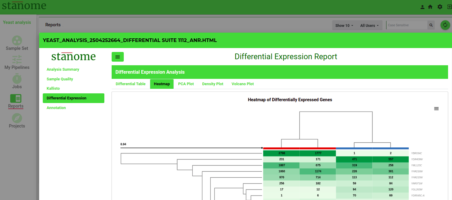
- Heatmap: The heatmap (Fig. 1) of the top 200 DEGs. Heatmap visualizes the comparison of DEGs expression across samples and within the sample. A brief description below the map enables users to understand and interpret heatmaps. The red color rectangle in the heatmap indicates the upregulation of a gene and the blue color indicates downregulation.
- PCA & Volcano Plots: A PCA plot enables users to visualize the variability in the replicates of the two experimental conditions compared. All replicates of a condition are depicted with the same color. Grouping of samples indicates if replicates are similar among the same condition versus between the conditions.
- The volcano plot shows significantly differentially expressed genes. It is a scatter plot between log fold change of expression among different biological conditions and the significance of the change determined from the p-value. Volcano plots enable visual inspection of expression change across all the genes.
- Density: Shows normalization plots of samples normalized to overcome bias due to Read size and mRNA content.
-
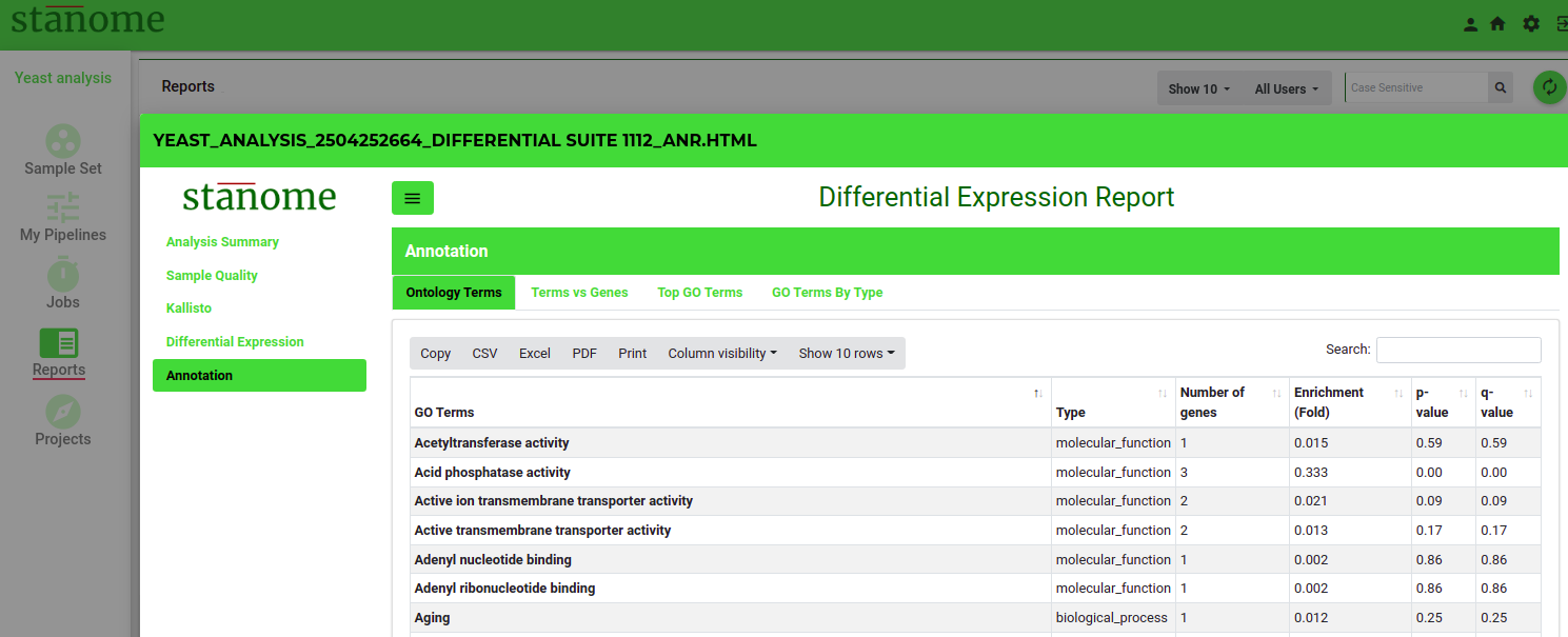
Annotation (FGSEA):
Describes Pathway analysis for DEGs (Fig.2). The top 100 enriched pathways are shown in the table along with their p-value and the total number of DEGs belonging to the pathway. This section also shows a bubble plot of the enriched pathways wherein the location of the bubble is determined from %DE genes in the enriched pathway to the total number of genes in the pathway.